
redesign of the screen-sharing feature for better accessibility
● problem
I've been asked to redesign the ZOOM Screen sharing option, as it wasn't accessible to orthodox Jews, who usually don't speak English - but use ZOOM a lot for learning and sharing.
● suggested solution
Adding Icons, Illustrations & making the entire screen more clear and accessible.
The Design Thinking Proses

🔍 Research (Empathise & define)
I've conducted a few user interviews in order to understand the pain points of an average orthodox while using the ZOOM app.
the conclusion was that the orthodox people often use ZOOM and they're very happy with it - even without understanding all of its features.
the main problem that occurred was screen sharing - it wasn't clear enough for the orthodox user, which caused fear of sharing wrong or privet things instead of the needed document.
based on my research I've created persons, user-story, user-journey, and empathy-map.


User Story
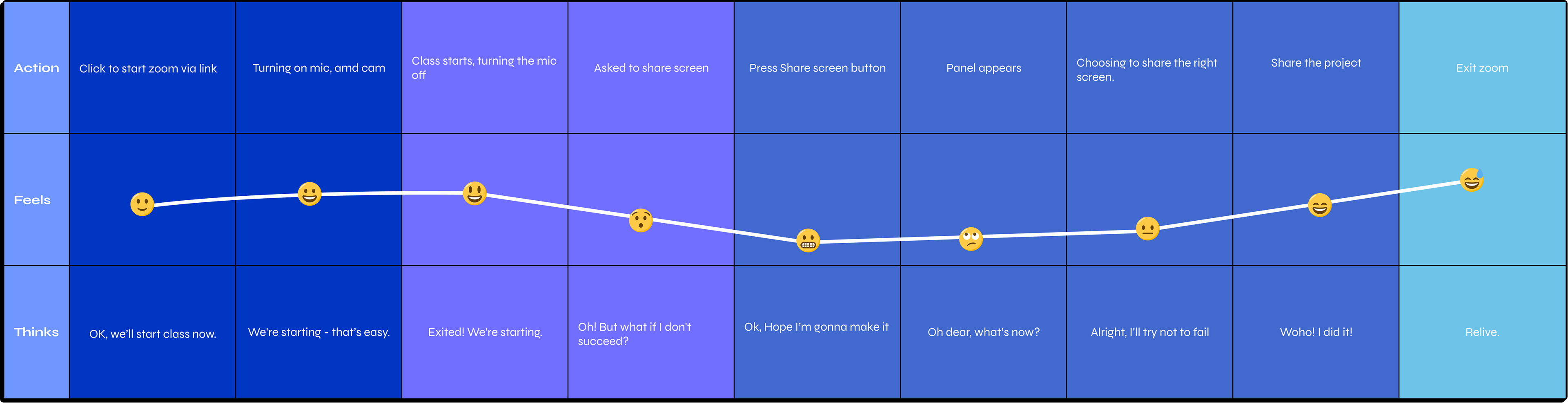
User Journey
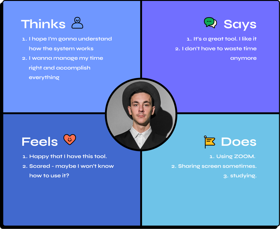
Empathy map
• What did I learn from the user research?
Zoom is really popular with ultra-Orthodox students, as it saves them a lot of time and money.
What are the problems?
New features (that are only explained in English) cause fear. To share the screen with care, not to skimp, not to press the wrong button, and accidentally share personal information instead of relevant information. Even though the interface is excellent, it is sometimes not fully understood by those who do not read or understand English. Several people talking at the same time causes confusion. Poor connections can cause delays.
What are the opportunities?
More visual explanations to help people understand how to use the various features, perhaps involving "onboarding" or short animated gifs that explain clearly to people who do not read (and therefore, can help with attention and concentration) how the features work and what they offer, the main one being screen sharing ("Screen share"). The level of use and speed of understanding will increase, and there will be less fear and apprehension about new features.
🧪 usability testing - part 1
For usability testing, I've asked 2 participants to do a very simple task - share a document via screen sharing on ZOOM.
Here are the results:

So we understood the problem. now, what's the solution?
📊 Competitive Analysis
It's time to check our competitors, see what they do and what we can learn from them.

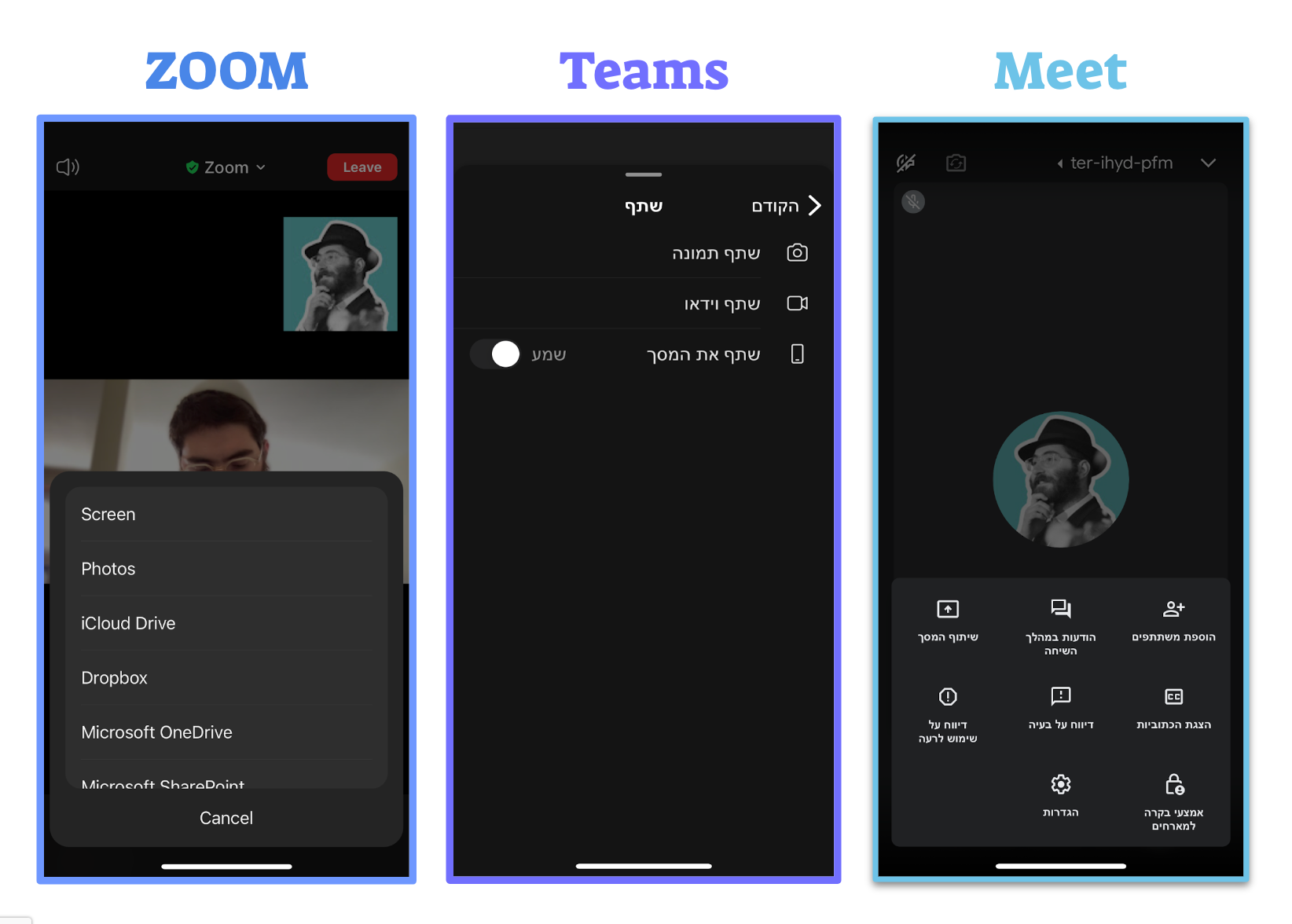
As we can see, all the competitors are using informative icons and the options are divided into sections.
• Here's what I learn from the Competitive Analysis:
A good meeting platform also provides whiteboarding, chatting, and attaching documents, as well as screen-sharing for presentations and student work. Both Google and Microsoft offer software for office/study work (presentations, documents, spreadsheets. These are similar to Apple's phrases and software. However, Microsoft's Office has the most market share).
interesting patterns that I found in the comparison:
There is a login screen and confirmation (regardless of the whitening room) to make sure the camera/microphone is working properly. It is entirely video on the main screen, and the options and features are up / down / on the sides.
what do I like to adopt:
Guest status, subtitles, illustrative icons, and possibly gifs, that explain more about the platform. Support for Hebrew. The small screen that shows me can be reduced so I can see it clearly.
Would I'd like to do the opposite of the competitors:
Perhaps not the whole screen should be what the lecturer presents. Maybe it should be the other way around, where the screen completely covers the screen, and all the different options, including the screen that shows me, should be hidden. Or integrated, like the courses' apps? Can the chat appear below the screen, on the same screen, when the screen is sized small? The answer may lie in user testing...
🕸 Wireframes (IDEATE)
Low-Fi

Warning:
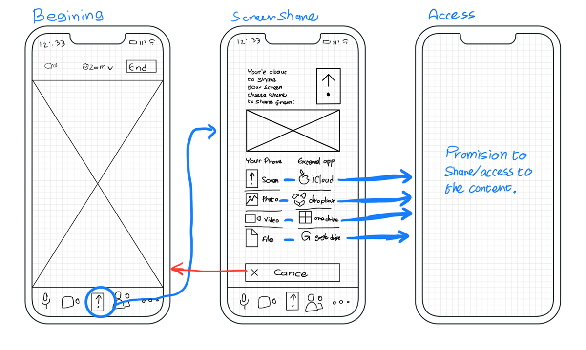
Text - “You’re about to share your screen. Please choose from the menu below”. An icon that represents screen/info.
Categories split into two:
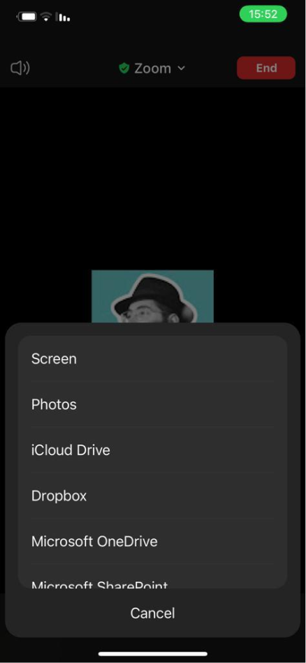
From your own device (Screen, Photo, Video, File) External app ( iCloud Drive, Dropbox, One Drive, Share -point, Google Drive
High-Fi
Several critical commonalities were identified during the UX study:
The language barrier. Illustrations and icons were added for this reason.
The fear of uploading files. We gave the User a better sense of control by placing the Cancel button closer and more prominently.
There are many options for sharing with Zoom, both from the device itself and from external applications. The options were divided into two vertical columns, which also eased the cognitive load, so as to reduce confusion and improve the user's sense of control.
🎨 UI Design + 2nd Usability testing
(PROTOTYPE)
I've looked at the visual guidelines of ZOOM, and according to that, I've created the UI.
Screen sharing
General
Screen sharing mode
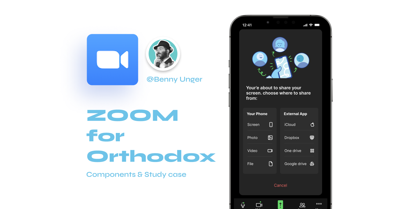
And the final result... (🥁):
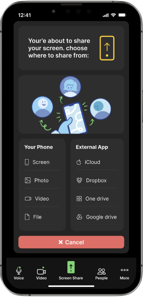
- Warning: you are about to share your screen.
- Informative illustration.
- actions are divided into 2 sections - a device and an external app.
- Cancel button is more clear and bold.
🧪 When I tested this design, a few problems occurred:
1. There's too much info and too much cognitive load.
2. The screen sharing icon at the top looks pressable.
3. the cancel button draw intention from the rest of the screen.
🎉 the final suggested solution
And so I've come up with this UI Design:
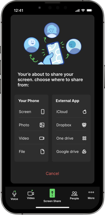
1. I've taken out the top warning and replaced it with the illustration (which by the way, I made).
2. I Took off the icons from the titels.
3. The cancel button got fewer details.
I tested it once again, after the changes, and the results were 91% of success - the participants understood the screen sharing option, their self-confidence grow, and as result - their satisfaction was bigger.