
● problem
Jewish people, who keep the laws of "Kosher" find a hard time when it comes to planning a new trip - is there kosher food, restaurants, hotels, and apartments in the destination?
● solution
An app that will gather all the correct and accurate information about Kosher resources almost all over the world
The Design Thinking Proses

❤️ empathize - survey & interview
📊 Survey
My task was to design an application for kosher travelers.
Initially, I assumed that kosher travelers would look for kosher places to eat (restaurants), kosher shops, and kosher accommodations (hotels and apartments), as well as Jewish heritage sites.
A survey I posted on Facebook and WhatsApp groups revealed a different picture.
*Note: the survey was made in Hebrew.


Survey results:
1. Children and youth in a family
2. Take a vacation at least once a year.
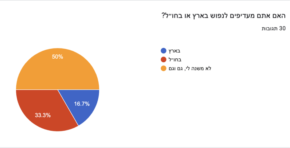
3. Vacations in Israel or abroad don't usually matter.
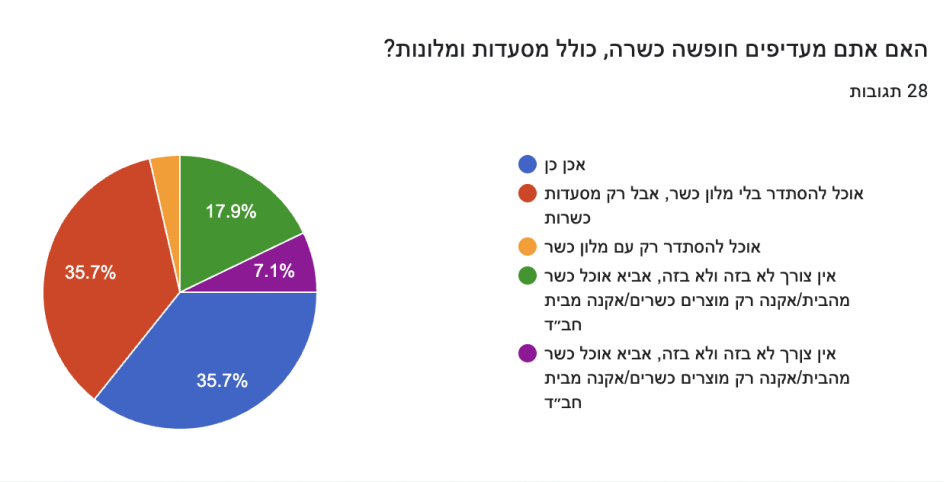
4. Kosher restaurants and kosher hotels are equally popular with those who need only kosher restaurants.
5. A majority of spouses will plan the trip alone, using Google Maps, the Internet, etc.
6. In advance, most people prefer destinations with a Jewish community or Bet Chabad.
7. Kosher vacations are usually not organized by a single application.
8. People are not so much interested in viewing local Jewish-history sites.
The following features are suggested:
● Comparison of prices, recommendations, and ratings by users
● By destination, find kosher restaurants
● Photos of kosher and valid kosher products, kosher nearby, what is allowed to be prepared, and how
● Restaurants in the vicinity of a place
● Option to filter kosher restaurants by location in the world, option to know if a product is kosher in the supermarket
Conclusions:
● A list of kosher products in that country/city must be added.
● A list of kosher restaurants must be prepared, which users will rate.
● The proximity of the restaurants to a synagogue/Chabad/Jewish community/kosher hotel/central destination must be presented
🎤 interviews
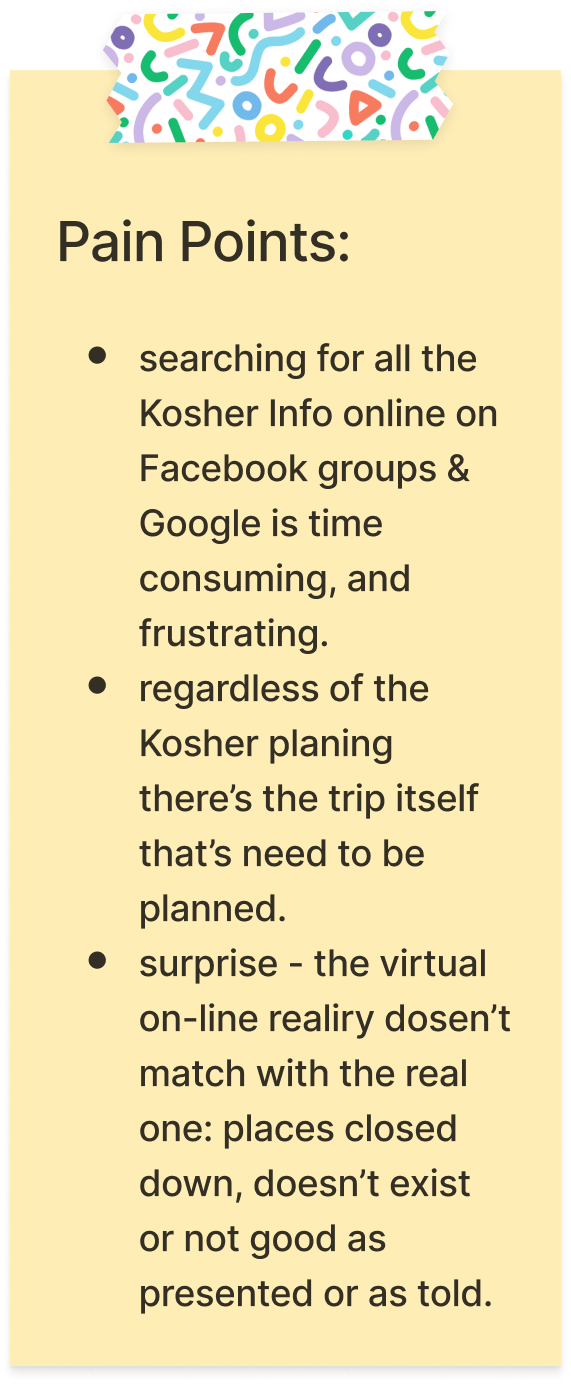
I conducted interviews with kosher observant people who travel abroad with their families. Besides the quantitative information received in the survey, I was given qualitative and in-depth information - a better acquaintance with the users, and an understanding of their pain points.
*Note: the interviews were conducted in Hebrew, so as the note I was taking.
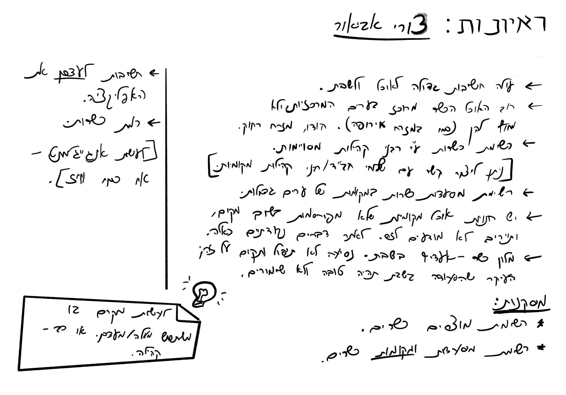

Conclusions:
here's what needs to be on the app:
● A list of kosher products, even those that are not necessarily marked as kosher.
● List of kosher restaurants.
● List of small private places/bed and breakfasts.
● It can be updated by the rabbis of the community and by the users.
● Saving for afterward.
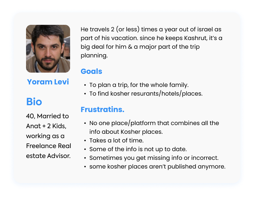
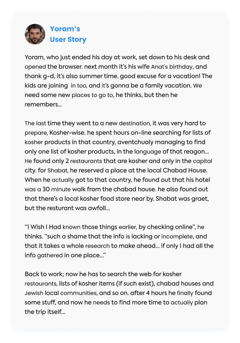
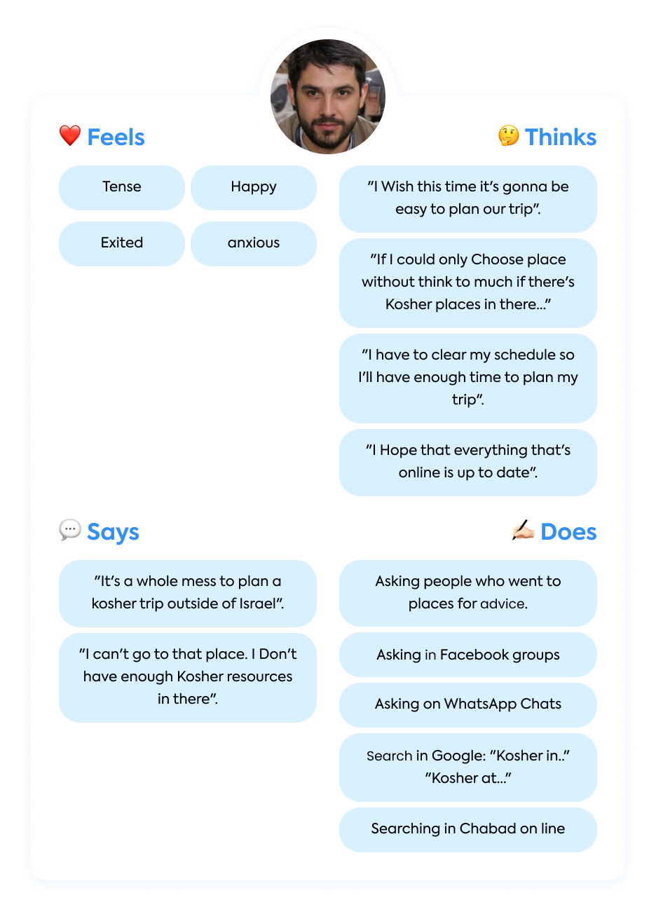
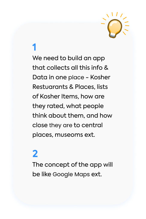
🎯 define - pERSONA, USER STORY, USER JOURNEY & empathy map

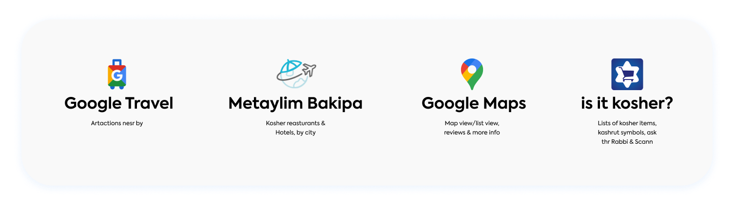
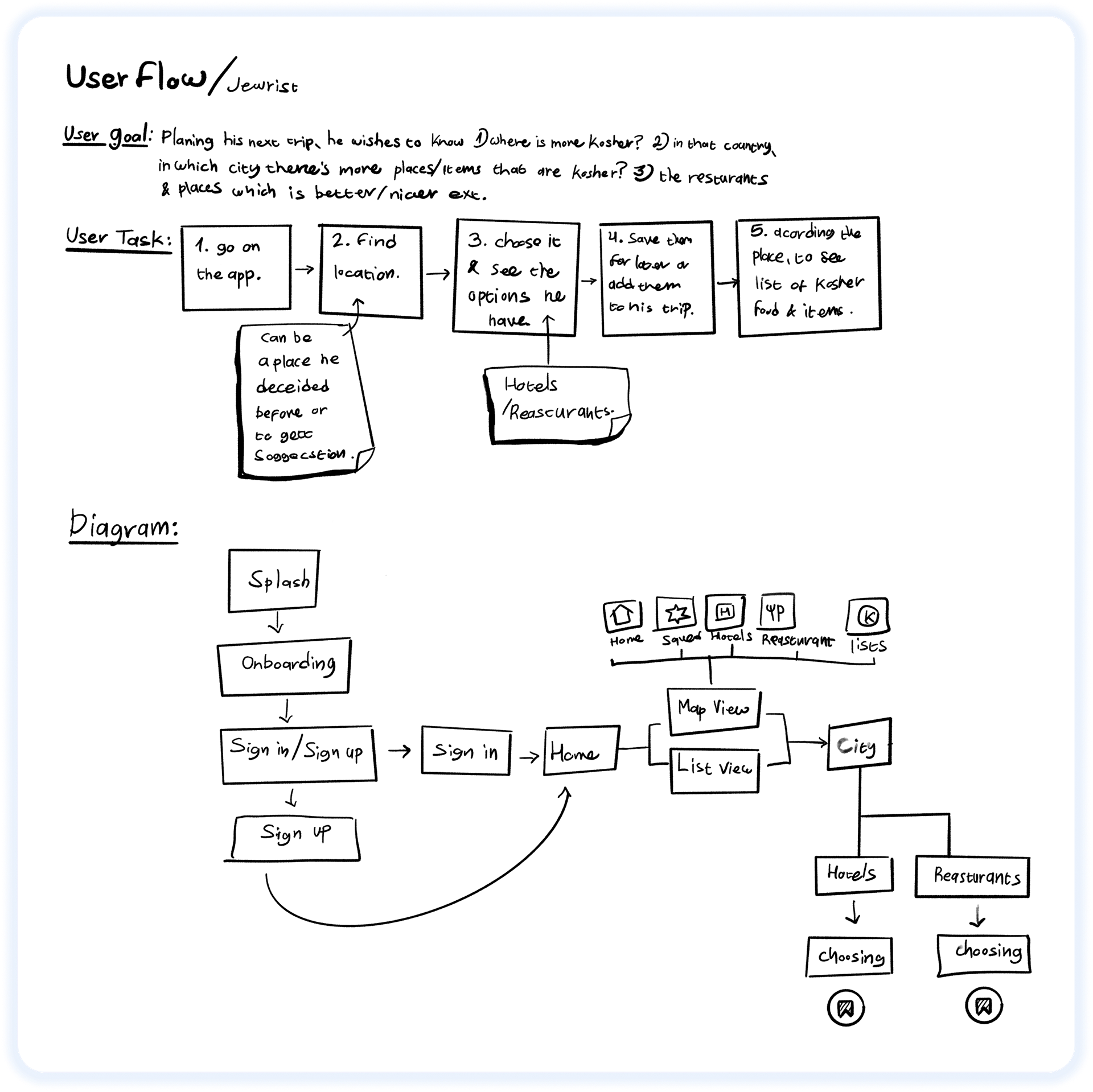
💡ideate - COMPETITIVE ANALYSIS, user flow & wireframes

✍️ 🗣 UX Writing - microcopy

📱 PROTOTYPE, UI & USER TESTING NO. 1


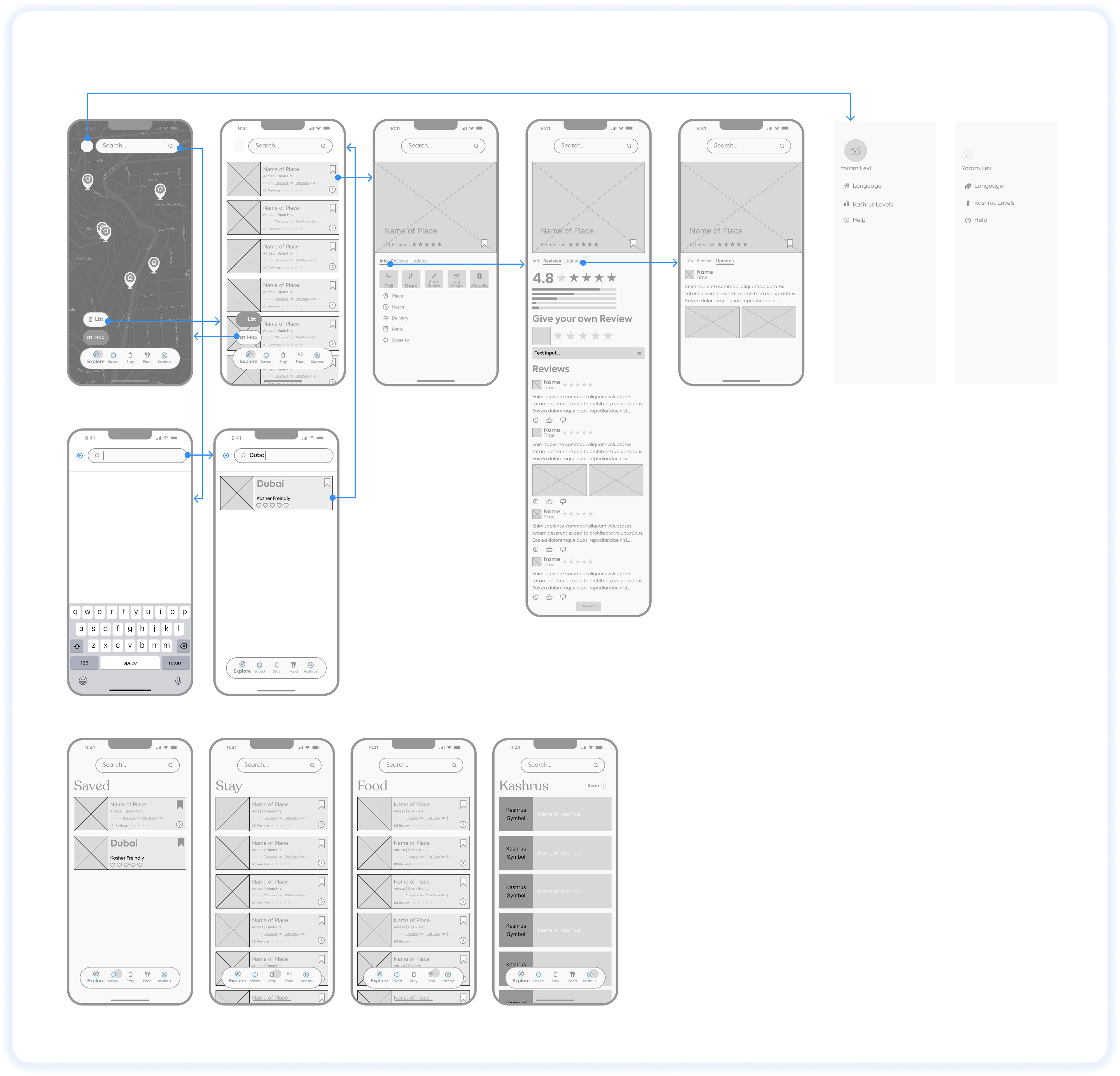
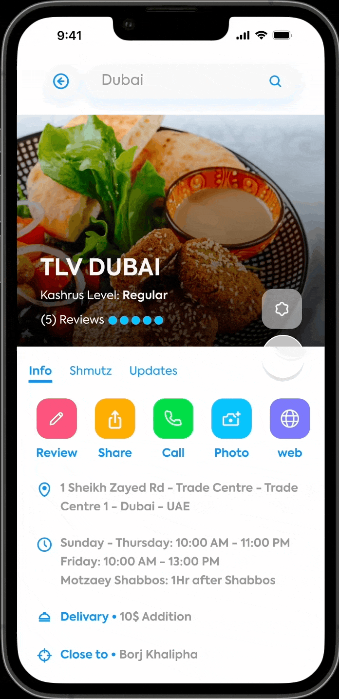
So after the research, the insights I've got, and the wireframing, I step into the next level - UI design and prototyping for the screens, so we have a look and fill of the final product and I can use it for user testing.
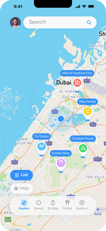
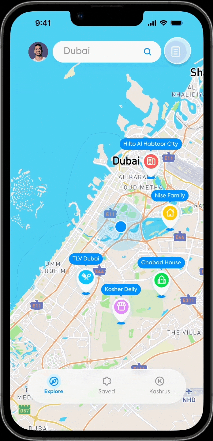
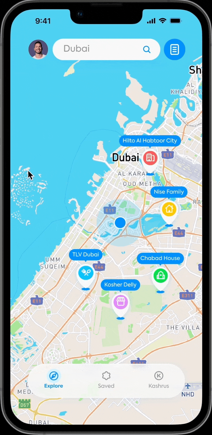
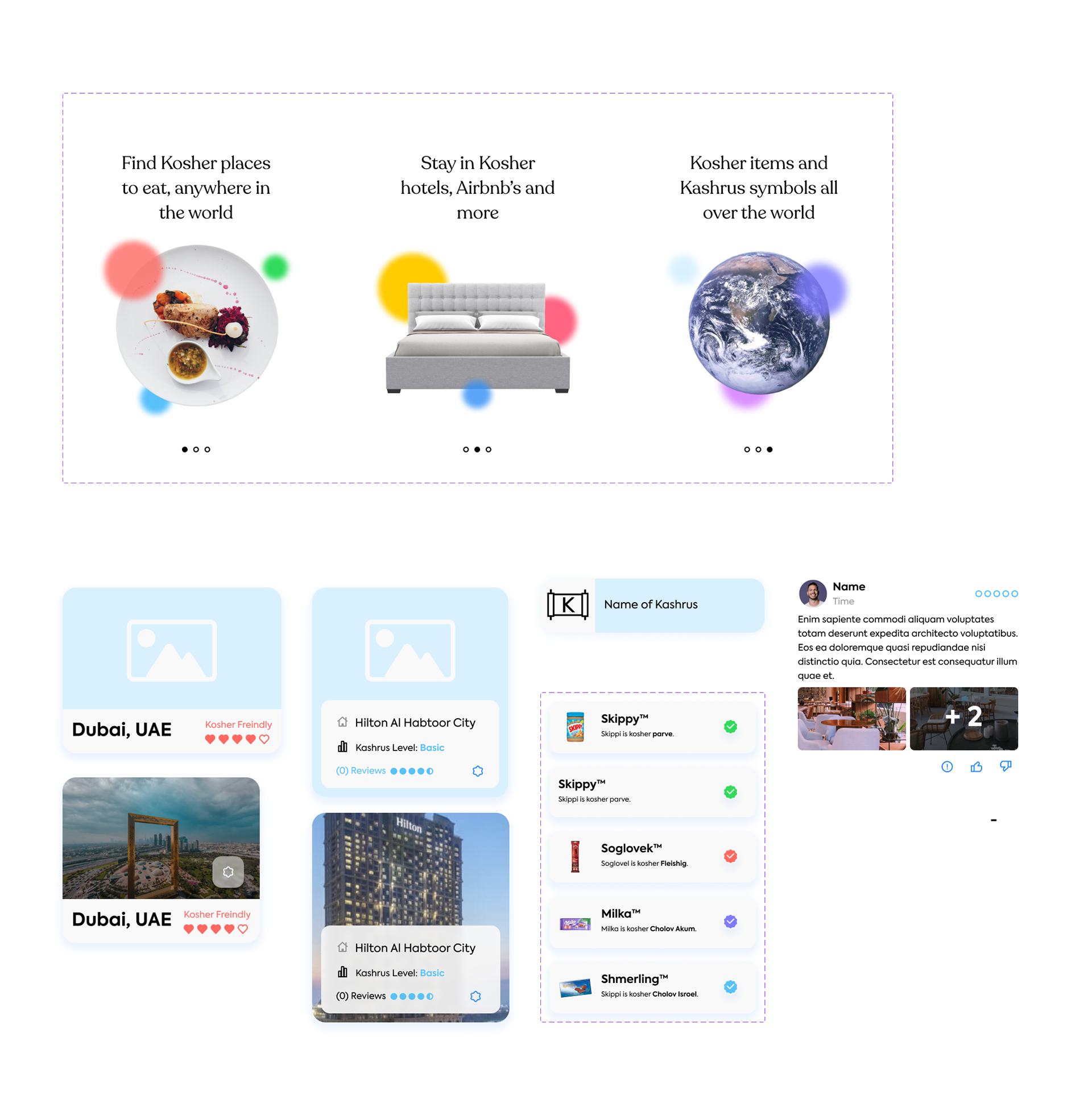
1. the home screen ("Explore") is made of two states: map and list. in order to switch between them, you can do so by pressing the button that appears from behind the nav bar, right behind the Explore tab. after choosing the desired state the button pops back in behind the tab.
2. I made 5 tabs:
● the explore tab which includes the map/list view
● the saved tab for items that were saved using the Magen David button
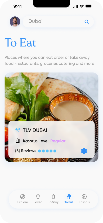
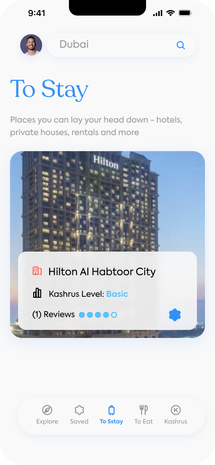
as I figured from my research that some people only looking for kosher places to eat and not necessarily to stay at, I've separated the experience into two tabs -
● "to-stay" tab for kosher hotels, apartments, and Airbnb's
● "to-eat" tab for kosher restaurants and groceries
● the kashrus tab - for kosher symbols and kosher food that doesn't have kosher symbols.
🔴 the problems I found during user testing:
→ people didn't understand the map/list view idea at the explore tab! it didn't match the gestalt rules, people didn't understand how to use it and how to switch modes.
→ people thought that the "to-stay" & "to-eat" tabs are for planning or saving. even with the saving tab next to them. Also, the people expressed their desire to see both kosher accommodations and places to eat as they might want to go.
Insights:
→ we need to get rid of the map/list buttons that pop up. people don't get it, they don't use them, and it's not working with the gestalt law
→ we'll have only 3 tabs.
📱 PROTOTYPE, UI & USER TESTING NO. 2 🎉 - final results
MAIN FLOW
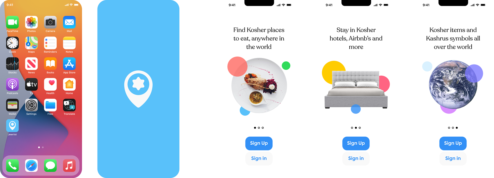
Splash & Onboarding

Sign up & Sign in

Explore tab (Home page) - map/list view, Sidebar menu with & without placeholder
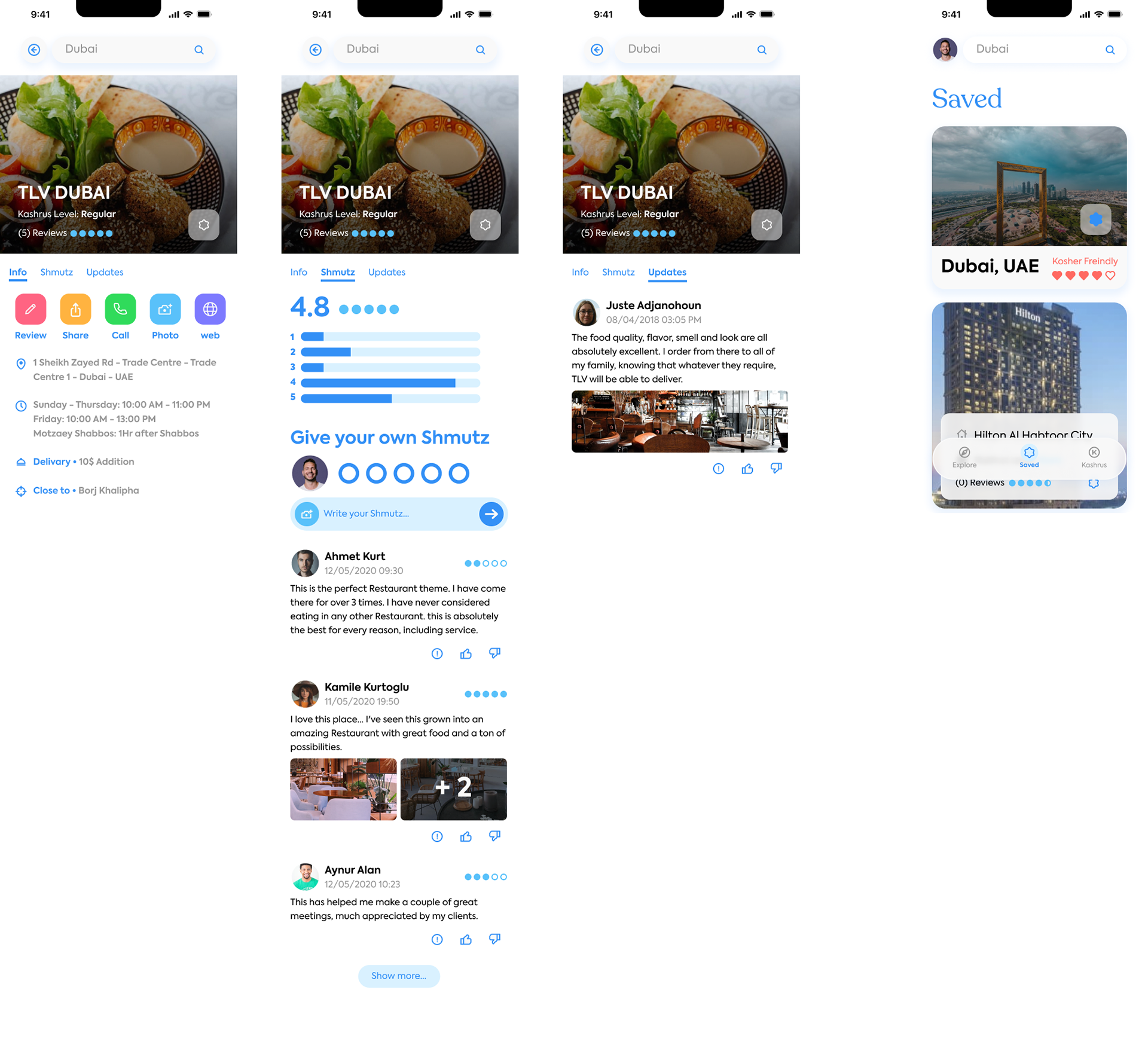
Pin page & Saved tab

Kashrut tab - Symbols and food
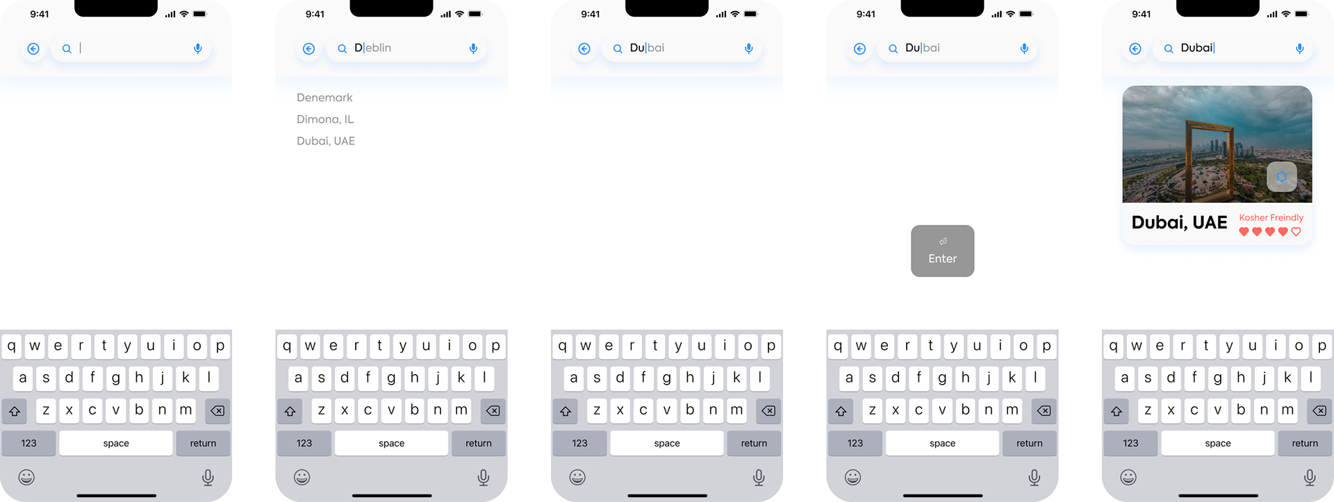
Search flow
edge use cases
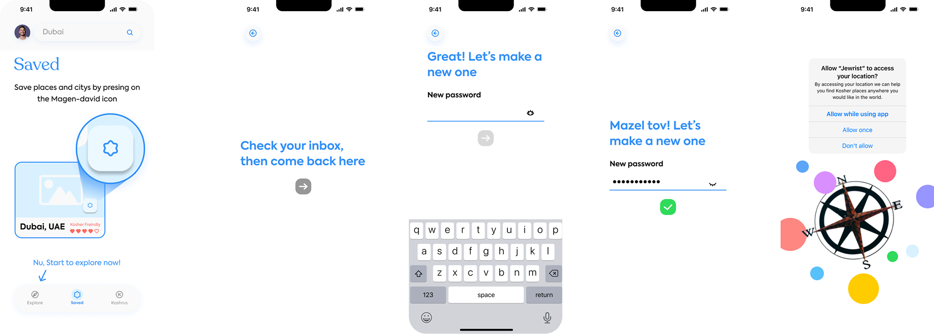
Empty state (Saved tab), Password restore & location access permission
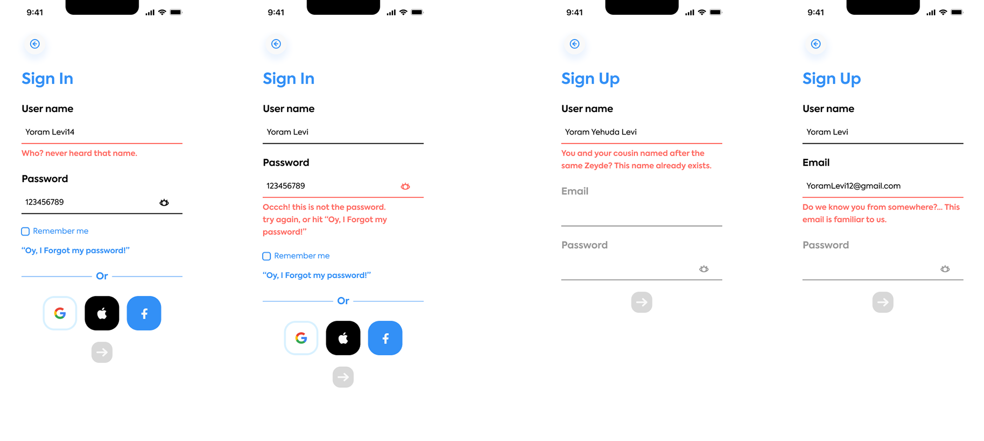
Sign in & Sign up errors
🤹 interaction design
Splash & Onboarding
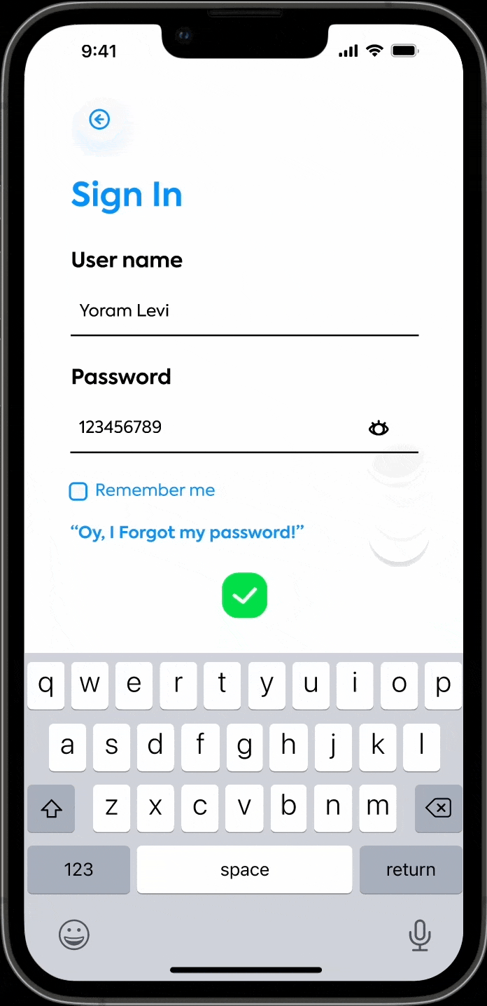
Show/hide password

Show/hide sidebar menu
Map/list
Pin to item page
Item page
🎨 Design system
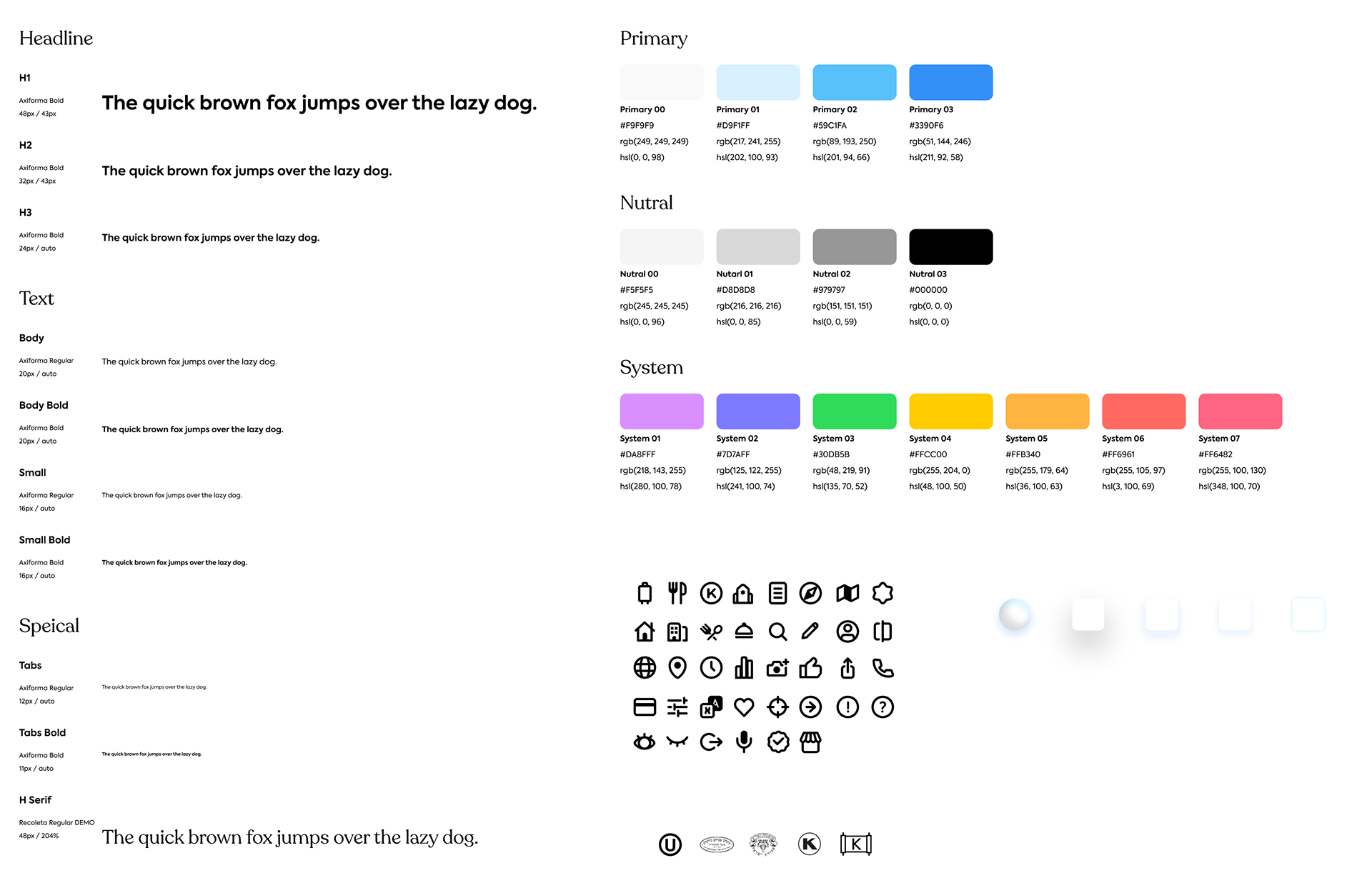
Atoms
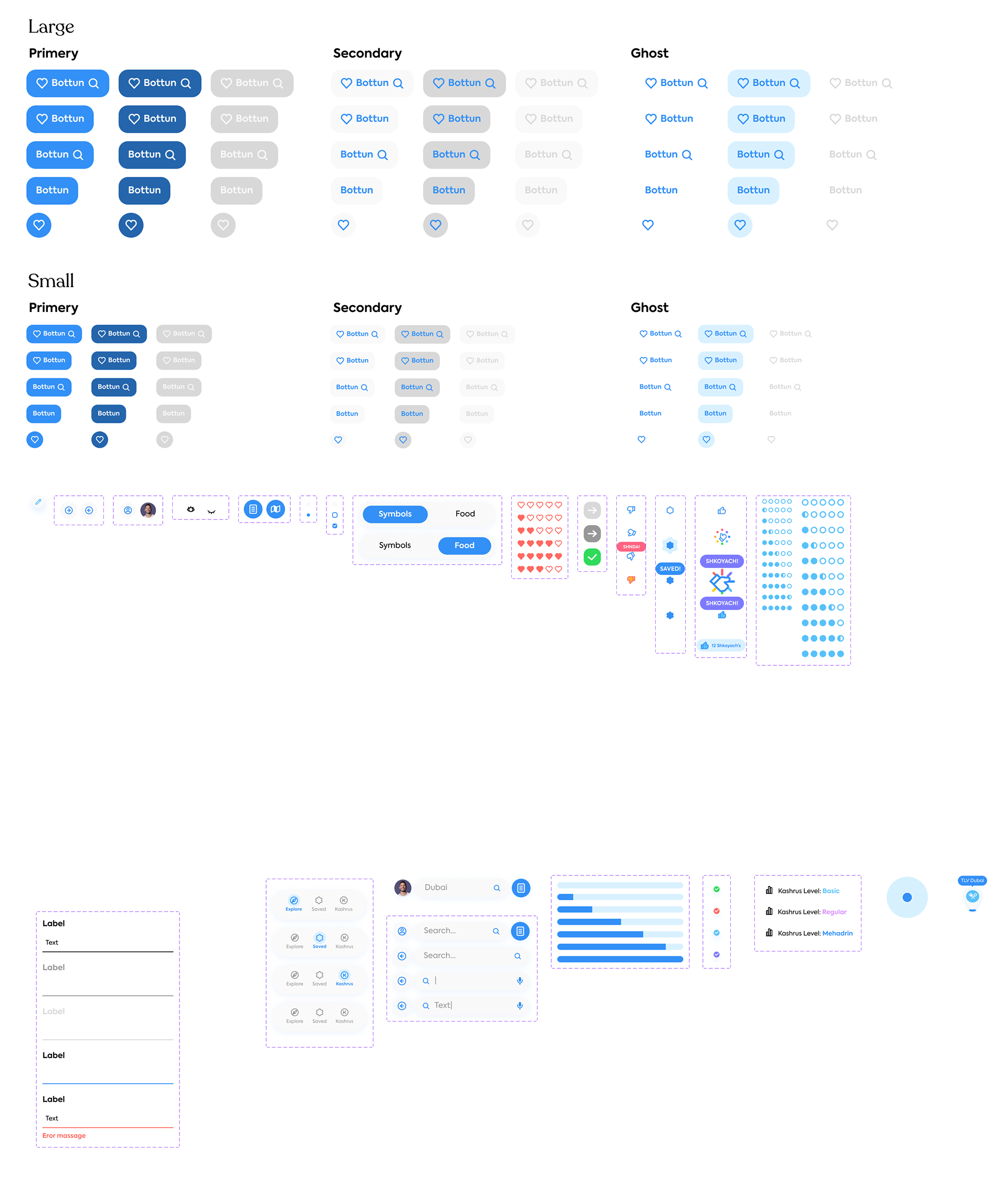
Molecules
Fragment
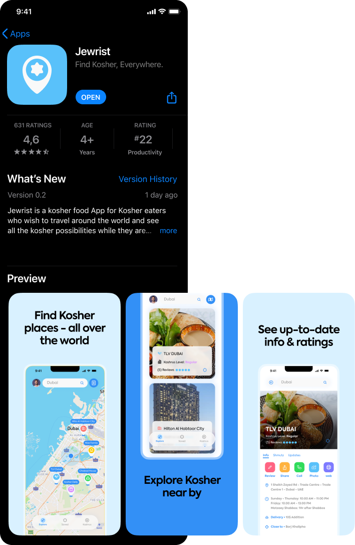
mockup - app store
thank you for reading ❤️